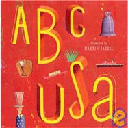
 I thought this introduction to the alphabet had a good twist by using American icons as the illustrations. Each letter had an example (theme) and were represented in interesting ways. Jarrie did a great job of creating whimsical paintings that are appealing to the eye. The colors were bright and the style was different from what we typically see in children's illustrations (a more square, hard-edged painting instead of softer lines and shapes with watercolor). There really wasn't much to read, so a very young reader would enjoy looking through this book.
 I was a little surprised at one of the letters. H is for Hollywood and the paintings are of women with their chests half hanging out of their dresses. I thought this was an interesting and sly way to insinuate that there is a "trashy" side of Hollywood. I compared the depiction of women from the H page to others and none of the others had such large chests or were uncovered. I thought it was funny and don't know if it would slip by a casual reader. Since having an expert in class talk about all the hidden meanings and symbols in picture books, I have been looking longer and more critically at illustrations. There really wasn't anything that made this book stand-out more than the next ABC book besides the afore mentioned Hollywood observations.

No comments:
Post a Comment